Primary wireframes for Routernote
Dec 21, 2020
This post has the first 4 wireframes for Routernote, and I think these views will be the major ones I need (famous last words???). Many professionals make painstakingly detailed wireframes with Photoshop or some other equally complex software. They might need to convince people to give them money to let them build the thing for real. For me, I want to concentrate on making the final views with actual HTML/CSS, so these are probably closer to what most people think of when they hear "wireframe" - a pretty coarse sketch made in LibreOffice. That said, the exercise took about 10 days and consumed a lot of my subconscious when I wasn't directly thinking about it. It was very useful because it made me think through exactly how I would want to interact with the app to do things like search, filter, and add new data.
One of the big decisions I made was that this would be an app with tabs, like a browser. I often wish that Word and Excel had tabs rather than separate windows for every document, because I often have lots of files open at once. The tabs in modern browsers are my favorite thing about them. So each of these views will open in a new tab but the same window instance. That way you can have one tab open with your search, and multiple tabs open looking at different routers.
1. Search
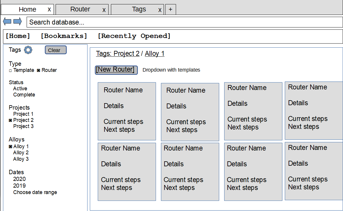
The "home page" that opens when you make a new tab will be the search view. I have patterned this after McMaster-Carr with tags/categories on the left (Amazon does this too but I really like McMaster-Carr's implementation). The idea is that at first all tags are selected so that you are viewing all the routers. If you select a tag, it filters the category that tag is in to only show results with that one tag (and gives you the chance to add more tags from that category if you need). Note the Type and Status categories. These will be built in and let you easily edit templates and see what you are currently working on. I'm trying to make bookmarks and the "recently opened" tabs easy to access by providing drop-down menus below the search bar. The search bar will be type-ahead and I plan to have the option to search within the current results or the entire database a-la Github, where if you start typing a drop-down appears with options to select where you want to search. I think this is much easier than having two search bars, or even two Search buttons. If you click a router in the results area, it will open a new tab with that router's details to view and/or edit.
2. Router Details
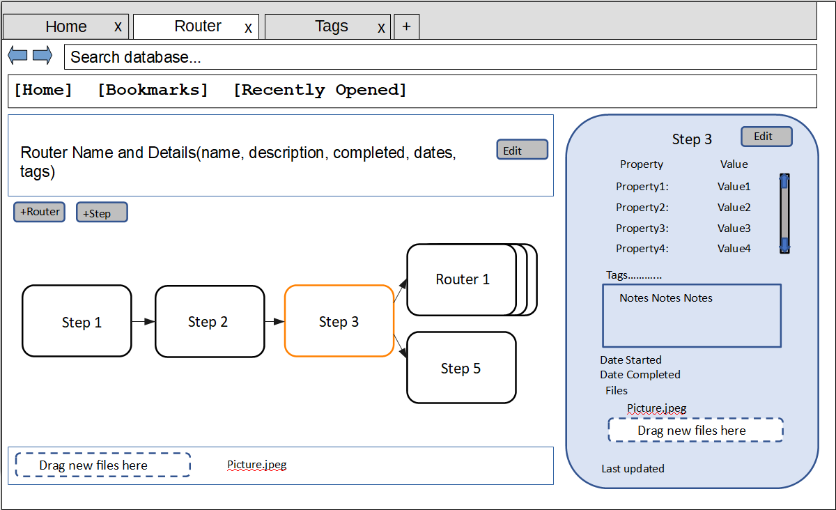
The Router Details tab is a standard master-detail view, with the master view being a simple directed graph (or network diagram, according to MS Project) of all the sequence nodes (which I define as a step, link or sub-router) for that router, labeled and/or visually coded by status. This directed graph will be made with D3.js, an interactive visualization library. It allows for new nodes to be made just by clicking on an empty space, and links to be made by dragging from step to step. The Details view on the right will show the details of whatever step or link is highlighted. There are some areas on this screen that are labeled drag-and-drop for files to be associated with a particular sequence node. I plan to made each node drag-and-drop as well.
3. Router Details in Edit Step mode
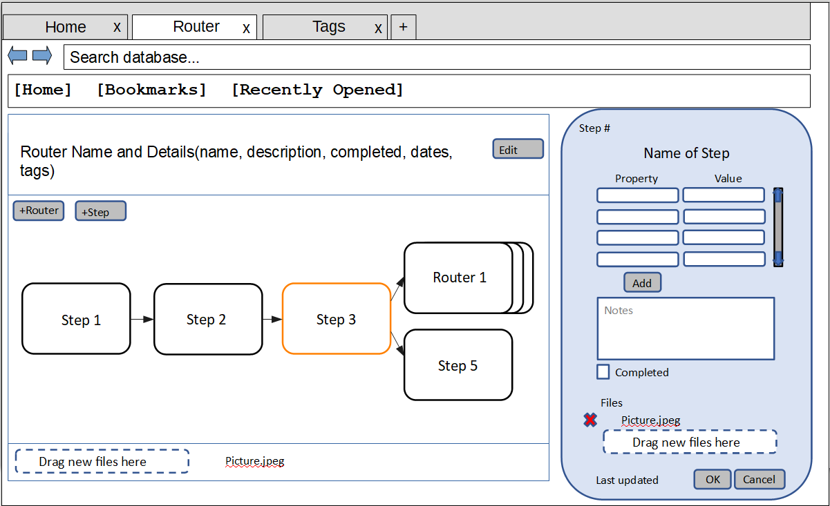
I wanted to have a visual difference between saved data and a form that is open for editing data, to reassure the user that their data is in fact saved. So there is an Edit Step mode that turns the details into a form to fill out and save.
4. Manage Tags
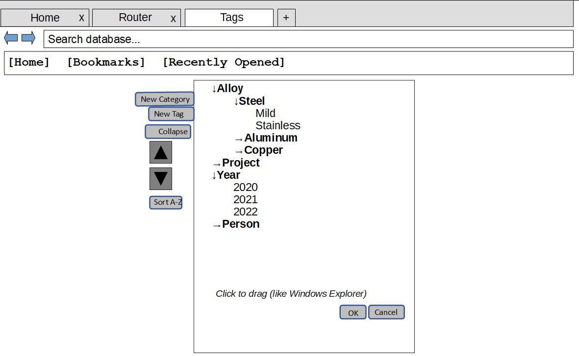
I almost made the Tag sidebar on the search page allow edits to handle managing tags right on the homepage, but decided that managing tags and using them at the same time would be too confusing to implement. The concept of a separate Bookmarks tab in modern browsers helped push me towards making a Managing Tags tab. I hope to make managing tags as intuitive as possible, and will draw from Bookmarks (again) and Windows Explorer (which is familiar if not intuitive) to help.
I see tags as being the primary way to filter and organize data in Routernote, so ease of use is really important. Why tags and not a folder hierarchy? Have you ever tried to find a document on someone else's project share drive? Sometimes you can find it, but it is usually not where you would have put it. Some people organize their folders by project, others by year, others by customer or PO number or product line or... the idea is that tags will be easier for the non-owner to quickly find what they need, like at McMaster-Carr or Amazon where item discovery is paramount.
Issues that came up during the wireframe process
It was really helpful to go through the process of making wireframes, because it forced me to think about how exactly the user was going to interact with the app. Here are some of the issues that came up and how they are currently going to be handled:
- How to edit and insert templates: I was originally going to make a separate tab or window just for templates, because I thought it might be too confusing otherwise. But a template has the same data structure as a router, and in fact is just a special kind of router (one without a normal Status, maybe the Status should be Template or something). So I hit upon the idea of just filtering for it with tags.
- What tags does a router get when it is created from a template? This is a tough one for me. Would a new router inherit the tags of its template, or the tags of wherever you are in your search filter? If it inherits tags from its template, things could get confusing if you create a new router and then it does not show up in your current search view - this supports giving the new router the same tags currently filtered for. On the other hand, sometimes a template makes the most sense in the context of certain tags and so you would want the router to preserve those rather than overwrite them. I think I need a way of informing the user and letting them decide what to do when a new router is created.
- Bookmarks and history/recently opened: As I realized I wanted these in the app as a useful navigation tool, the question comes up of where to store them. These are unique to each user, and I really don't want to have people log in. I guess they need to stay on the local machine. How to store them? I think I need the full path to the database on each bookmark or history item, along with the item itself (as identified by a unique ID in case the title or tags change).
- Database name is in the title bar: Thinking about storing bookmarks led to the realization that of course there could be multiple databases that someone would want to connect to. The database name should be in the title bar of the window.
- View current work: One of the goals of this app is to help someone keep track of current work. It can be fed into a to-do list of items to check up on, help ensure that the right work is done and enable looking ahead to get ready for future steps. The wireframe process made me think about how to access such a view and what it would look like. For awhile I was going to make a separate wireframe just for the view, but it ended up looking like the search view and I realized that if a Status tag category is added, you can filter for Active steps and get what you need. Any more would be exporting such a list, which could be a future feature.
- How to insert a Router within another router: The idea of adding a step to a router by clicking in the network diagram area is fine, but what to do when you need to be able to choose between two options? For now I am settling on buttons and will also add right-click options for both (think of the New right-click menu item in Windows Explorer).
- How to view the directed graph and step details of a sub-router: I would think that clicking on a sub-router would just display its basic details in the same place the Step details are shown, but we need a way to actually open up a separate tab for the sub-router. For this I have a button, and it also might make sense to enable double clicking or another context menu for this.
Of course there are lots of features besides the ones discussed in this post, but if I got these basic ones done I think the app would be useable. Right now I'm learning about testing Angular applications and researching local storage databases that would be appropriate. Stay tuned!